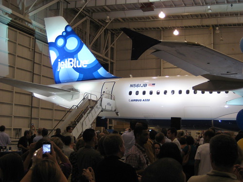
Today, after us airline geeks have been speculating for so long, jetBlue came out with it's new livery....and, well.....not what all of us were expecting.
Sure, we have said that this change won't be huge, and we've speculated on items that they will change (such as their euro-white fuselage!)
They didn't do much, besides making billboard style titles, changing the color of the winglets, and taking out the "www." on their engines, so they could make "jetblue.com" in a larger font.
I'm happy with the increase of their font size for their fuselage though, but I am really disappointed that they decided to stick with the traditional "euro-white" that many airlines have been moving towards. I don't have much of an issue, because I still think that it does look really nice, but it would be cool if they could do something to set themselves apart! (and yes...I know, it would be additional money for them to paint in any other color besides white)
I think that this livery looks good, but I am really hoping that the tail design doesn't get applied to the entire fleet.....look at it! It doesn't even look finished!
